
As the old saying goes…
‘Don’t judge a book by its cover…’
Unfortunately, the reason it’s a saying is that everyone does. It is a truism that you can not escape as an author. It is also one where so many self-publishers make mistakes, myself included. It is also an exception to my golden rule and one of the few area;s where the ‘For a small fee‘ people of the internet can actually be of help. While they are still looking to make money out of you, in the majority of cases they are selling something of worth. Though I still advise caution and doing a bit of research before you part with your hard earned money, because there are those out there not above making a fast buck by selling the same artwork serval times over, or by selling artwork that is not theirs to sell. There is also another option which you can go with and make your own, one which requires as much caution, for similar reasons, and a little bit of basic knowledge of copyright law before you start. The second option is only really viable if you’re artistically gifted and/or know your way around some computer software.

Buying in a cover…
I am going skip over the first option a little, but I will put some links at the bottom for cover artists I know of, who are legitimate and do interesting work. The word of caution is this, avoid sites like ‘Ffiver’ and other cheap ass options. If you are going to pay for a cover, then pay a reasonable amount for one. There are lots of sites that do deals on premade covers, where the artist has made something they think will be a good cover for someone. These are worth a browse if you’re really lucky the right cover may jump out at you. But make sure the cover will be exclusive, and that they will do the graphics for you, and work with you to get them right. You can expect to pay between $50 and $100 for a good premade. Or $100 for a bespoke, minimum. Given how hard it is to sell books when you’re trying to establish yourself that may not sound like the soundest investment. Self-made covers and self-publishing often go hand in hand because of this…
The golden rules if you go this route and buy a cover are:-
- Make sure they are a legitimate site and own the rights to the work they are selling you.
- Make sure you get exclusive rights once a cover is sold to you.
- If it’s dirt cheap, on something line ‘Ffiver’, it’s probably neither of these, and the last thing you want is a lawyers letter through your door from an artist demanding payment for their work that someone else has used. Copyright law exists for good reasons, stay the right side of it, if in doubt walk away.
Making your own, a path of many pitfalls.
Making your own cover can be a rewarding exercise, after all, who knows your novel better than you? Who knows if a cover really speaks about your story more than you do? Who could tell if the picture of the girl on the cover actually fits your main character if not you? Clearly, you are the best judge of your cover… right?
No, you’re not… I know that may sound counter-intuitive, but no one is closer to your subject than you, and being that close is a problem. You see something that speaks to you about your novel, because you have read it, probably more than anyone else ever will. You have read it again and again. Turned it over in your mind and found every small detail. Things within it will speak to you, in ways they never could to someone else, and so any cover you chose on this premise will talk to you the same way…
That is not what you’re trying to achieve, what you are trying to achieve is a cover that will speak to someone who has never read your book. Someone who has never even read the blurb on the back… And what you want it to say is, ‘README’. So the best way to judge if your cover does that is to ask someone who has never read it for their opinion. You need to know if:
- It makes them want to read the book.
- It draws them in.
- It tantalises them with the possibilities.
- If it’s a genre book, does it say ‘this is hard- Scifi‘ or ‘this is a crime fiction‘ or ‘this is’ whatever the genre it is.
- Importantly, does it catch the eye and invite the prospective reader to take a second look
Because if it doesn’t do those things, you’re going to miss out on the very readers you’re trying to attract because believe me, they do judge a book by its cover.
The best advice is to take your time, mock up a few different options and ask people what they think. Engage with the community, they are sure to offer advice and suggestions and answer the simple question ‘out of these two options, which is best?‘
As I mentioned earlier, that I have made mistakes in this area. Indeed all the posts in this series are based as much on my mistakes as they are on anything else. Which is fine, I am happy to admit them, and I have never been afraid of making mistakes, I just endeavour to make sure I learn from them. You’re going to make a few yourself, believe me, we all do. Hopefully, however, I can help you avoid making the same ones I did. Of all the mistakes I have made in self-publishing getting the cover of my first novel wrong was biggest one.


These are a bunch of covers my first novel has had at one point or another. And my first novel is something I love, as it was and remains a little slice of my soul. It’s not the first one I wrote, it is, however, the first one I published, and the first one that was truly completed. The cover’s above are all the ones I made for it…
Now the first one, or the ‘black‘ cover as I like to call it, was made entirely by myself. With nothing more sophisticated than MS publisher. With MS fonts, using word art, and a picture of a bright shiny apple, that was all but begging to be eaten, upon it. I am tremendously fond of the imagery, an apple, the fruit of the first temptation, a symbol for the innocence to be lost with the first bite… It really speaks to me of some of the main themes of ‘Cider Lane‘. It says interesting things about the novel inside the cover, to me at least…
It is also, let’s face it, utterly awful.I mean it’s really terrible, with its crappy fonts and it’s slung together quality. It just screams amateur hour. I never actually published it with this cover, which is a blessing. Not least because as my girlfriend at the time pointed out to me, ‘It looks like a rip-off of the ‘Twilight’ cover and a bad one at that.‘ Which would not have been so bad if I was trying to write a rip-off ‘Twilight’. But that isn’t what ‘Cider Lane’ is. It’s not even close to what the novel is about.
The second cover, or the ‘apple tree’ cover as it is known among, erm, well just by me… Is the original published cover for ‘Cider Lane‘, and again I like it and it speaks to me about the themes within the novel. Which is why after a lot of different attempts to put together a cover I was happy with, this is what I went with it. It was built in CreateSpace’s cover builder, the art was purchased over the internet from a photo supplier for a few quid, so it’s legitimate and unique. The version of the cover you see here, with the book of the month award it received stamped on it, was a later version made after the award, but is otherwise exactly as published both in paperback and ebook. The novel was for sale with this cover for over a year before I changed the cover design. It did not sell well… In no small part, this was down to the cover that ‘spoke to me‘ about the novel, because it may have ‘spoken‘ to me, but its said sweet bugger all to anyone else. Let’s face it, it tells the casual viewer nothing about the novel at all, except there may be an apple tree involved, and when the title is ‘Cider Lane‘ that is probably a given…
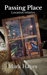
The last of the three is the current cover, which if you are viewing this you can probably also see on the side of the blog, above ‘Passing Place‘ my other currently available novel. You may well see they are similar in design. A vanity on my part I will get to it in a moment or two.
The important thing about the ‘Girl in the sunset’ cover, as I call it, is that it tells the prospective reader something. At least something more than ‘Apples‘ does. It has some mystery to it, some draw. How much, well that’s a matter of opinion. I do know that it has sold more copies than the ‘Apples’ cover did if you ignore the first month of release spike. In short, the cover has drawn more interest. It has also lead a few people to confess to me how much that first published cover turned them off buying a copy. “it looked like some non-fiction local history book” as one friend told me…
So ‘Passing Place’ and ‘Cider Lane‘ have covers that are similar, As I mentioned, this was due to vanity on my part. What writer doesn’t want to have a bookshelf at home with all their novels on it? Why would you not want them to have similar covers, a linking theme of some kind… That way Errol the Bookcase dragon can lay across them looking all dragon-like….

For those who are trying to guess, yes he is called Errol because I am among other things a fan of Terry Pratchett, so as I have a bookcase dragon I call him Errol. So sue me… But back to my point…
Vanity is all well and good, and if you’re a best-selling author who’s fans line their own bookshelves with your novels, then having a theme to your book covers is wonderful.But if you’re reading this, and you are even vaguely interested in my opinion, then I suspect you’re not Neil Gaiman, Stephen King, John Scalzi, Jim C Hine, Patrick Rothfuss, or indeed a whole lot of other authors I read regularly … (If I am wrong and you are, Hi, I love your work you’re awesome, and what the hell are you doing reading this blog,,,, Yes… I’m looking at you, Pat… I know we don’t want to pressure you, and your charity work is wonderful, but seriously I don’t want to die before the third in the king killer series comes out …. and yes Neil if you’re reading this I know Pat is not my bitch … but… but … ahem, where was I )
Oh yes vanity, here is the thing, I have made the same mistake with ‘Passing Place‘ I made with ‘Cider Lane’ originally. I made a cover that says nothing about the novel, and I did it because of vanity. That and to give Errol a nice place to sit for a photo op before I send out a load of signed copies to readers who requested them from me…
The ‘Piano‘ cover looks great to me, having matching covers looks great on my bookcase and occasionally when I publicise the novels together. But they are not part of a series, they have no links at all in any real sense, apart from a couple of things buried deep in the text. They are not even in the same genre. And ‘Piano’ tells the reader nothing about the novel, except they may be a piano in it. What it doesn’t say is this is a Scifi fantasy horror novel. One that questions reality as a perception of the mind explores’s strange, fascinating characters in a multiverse-travelling bar and grill. A place where causality can be bent by the chef, there is a forest in the cellar, a talking cat, a grey man who dances with his mop, a barman that has more than just a devil’s smile, a waitress who talks to trees, and listens when they talk back to her, which just happens to have an opening for a piano player grieving over the suicide of his dead wife and advertises it in a bus station window in the middle of no-where….
Instead, it says ‘Piano‘…
I love this cover… It is, however, exactly the wrong cover for the novel… and as I said, I have made mistakes. If you are going to use covers that take the same theme, then do so with good reason. ‘Passing Place‘ is the first book in a series, it should share a common theme with other books in the series as that helps to identify it as a brand… ‘Cider Lane‘ is not a part of that brand. With the exception of sharing an author and a certain degree of style, they have nothing in common, not even sharing a genre. Which is a shame because …
Themed covers work really well at making your novels stand out from the crowd, as a random example, take a look at the ones below:-

C.G.Hattons Thieves Guild series (which I highly recommend and have reviewed before on my blog here and here) does an excellent job of covers that catch the eye and have a running theme. I know they catch the eye because that’s how I ended up reading them, though her wonderful titles helped to grab me as well. But the common theme works well and draws you in. (C G’s website is here if you want a look) C.G may have designed the cover herself, I really have no idea if she did. But if she did then she is far more talented than just being an exceptional wordsmith, universe builder and title-thinker-upper of books. I suspect she had advice, help and found a talented artist who could work with her to make her covers really stand out. Which is why she is doing really well in the indie sci-fi genre.
The point I am stumbling towards is this. You are more than likely not all things to all men. I certainly ain’t. While I can string words together in a fluid narrative, I am not best placed to judge my own covers or design them, and neither are you. The point of a good cover is to make people want to read your words. So know your limitations, and do as I advise (not, blatantly, what I do). If you really want to design your own covers, go for it. CreateSpace, KDP and every other self-publishing all have cover design software that could help you. There are also plenty of other blogs full of advice out there in the community. I have a link to William King’s ideas on the subject below.
I intend to change the cover of ‘Piano‘ when I have the next book in the series written and ready to publish. I would do it now, but I am waiting to find the right cover or the right cover artist. More importantly, I am waiting till I have more than a working draft of book 2. Which, as I don’t even have that as yet, is going to be a while. Because if my books are going to judged by the cover (and they will be) I am going to try to make those covers as good as possible, and if that means spending some money I will do just that.
Further reading and self-creation.
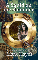
If your only publishing an ebook you only need a front cover and if you want to try making your own William King has a great guide for the vaguely computer literate here. Which I used when my old friend Kram Seyah needed an ebook cover. ( which was featured in the last post) It is best, or at least the most straightforward, tutorial on making an ebook cover I have come across. The cover of ‘A Turn of the Glass’ may not be perfect, but it suits the ebook and works well. It’s a small cheap novella, and I never expected it to sell quite as well as it has, as it was just an experiment, so I did not want to spend much money on it. But unless old Kram writes some more its never going to get a new cover. Mr Kings guide was a huge help in designing it.
Here as promised are some links to good cover designers sites that are well worth a look
- https://www.alchemybookcovers.com/
- http://engellmann.wixsite.com/home/book-covers
- http://www.goonwrite.com/
- https://www.facebook.com/creativedigitalstudios/
- https://thebookcoverdesigner.com/product-category/premade-book-covers/
- https://bookcovermachine.wordpress.com/https://bookcovermachine.wordpress.com/
There are a lot more out there so shop around, and find the cover you want, or the designer you want to work with. Really there is no substitute for doing your legwork with this.
Alternatively, you can make your own, though if you do, then I advise you make a few options and ask people for opinions. Makes sure the art is available, and you pay for it if you need to. Put as much time and care into it as you do your second, third and fourth drafts. Because if you don’t get it right then, you will find selling the book all the harder. Because people really do judge a book by the cover first and foremost…
Adios for now
Mark
Self-publishing: A guidebook for the tourist, will be back with another informative and occasionally rant post in the near future, feel free to follow the blog so you don’t miss a post
The previous posts for those who missed it can be found here.
- Self-Publishing: A Guidebook for the Tourist#1
- Self-publishing: A Guidebook for the Tourist#2: Reviews
- Self-publishing: A Guidebook for the Tourist#3: Unlimited Questions..
Links to my own social media, by all means, connect with me on them.


Pingback: Self-publishing: A Guidebook for the Tourist#3: Unlimited Questions.. | The Passing Place
Pingback: Self-publishing: A Guidebook for the Tourist#2: Reviews | The Passing Place
Brilliant opening It drew me to your site for more.
LikeLiked by 1 person
Pingback: Cover Story… | The Passing Place
Pingback: The somewhat belated cover reveal… | The Passing Place