
In the past, I’ve written a fair few mini guides for indie writers looking to self publish. One way to sum up these posts would be to call them ‘the list of things I have done wrong then had to fix’ or ‘My mistakes in self-publishing and how to avoid them’… I haven’t done any of these for a while, which you could decide means I make fewer mistakes than I used to… If you chose to think that, then bless your little cotton socks for thinking well of me, and would you be interested in buying some magic beans?
But putting that on one side, let’s talk about page counts… or to be more exact type-setting and the approaches to take when making physical books. To clarify, there are other type-setting issues and considerations when it comes to e-books (I may do a separate post on them at some point), but they are completely separate from the considerations involved with physical books when it comes to one particular factor, the factor of length, or to be more exact girth. It doesn’t matter how long an ebook is, if you want to self publish a 250000-word epic as an ebook go ahead. But if you want to publish that same book on Print-on-Demand you are looking at an expensive book, a book so expensive no one but your mum will be likely to buy it.
This is because POD services base their unit cost per book on page count ( and I am using Amazon as an example here though there are others of course, but they all apply the same basic logic to their pricing structures).
With Amazon that cost for a black and white novel is $0.012 per page, + the base print rate. So if we say that 250000 novel in print is 875 pages, the unit cost is $10.225 per book. By the time you add distribution costs to that, your unit cost is closer to $15 and if you sell a paperback on Amazon you make 60% of what remains as the price you set, so to make a dollar the minimum you can charge is $17… All the while readers can walk into the local supermarket and buy two paperbacks for the print cost of one copy of your book, and that’s before they decide to look for books in the local charity shop first and buy five for a quid… But all that said, the cost of buying a print copy of your book on Amazon isn’t really your issue, because the market for print copies of an unknown author just doesn’t exist on the internet. The only people likely to buy print copies are those who know you and like your work already. E-books are your actual market.
When all this does matter however is when you dip your toe into a brave new world. The world of direct selling, at conventions and signings etc, or asking indie bookshops to stock a few copies of your books. At that point page count really matters, and it all comes back down to that unit cost…
I recently dipped my toe in these waters, I have bought authors copies of my books before, in small lots, to sell to friends and family (which is another form of mistake btw, as they are the people who would buy your paperbacks on Amazon, and you are far better off asking them to do so as it drives up Amazon sales which make it far more likely you will break out of the friends and family market place). But as these were small lots it never really matter to me how much the books cost, because I was getting print copies just because I could, not because I was trying to sell them to the wider public. But if you are going to do that unit cost becomes very important very quickly, table fees, travel expenses, hotels, bookshops profit margins all combine to drive up the bare minimum you can charge for a book and in terms of conventions the number of books you have to sell just to break even, and the only thing truly under you control is unit cost. So I went through an exercise in the last week or so of trying to reduce that unit cost while keeping the quality of the books, which is tricky, particularly if what you really want to do is improve the quality in any way you can. here then is the issue…
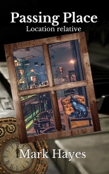
- Passing Place unit cost £5.15
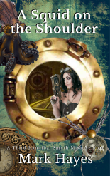
- Spider in the Eye unit cost £4.52
- Scar of avarice unit cost £1.98
Spider, in particular, was far more expensive than it needed to be. At only 75000 words it’s page count was well over what it should have been for a book that size due to the original choices I made in type-setting. Luckily by making smarter choices, I was able to cut that down quite a bit.
The first and biggest problem was fonts. Spider was typeset in Arial 12point, industry standard is more or less Garamond 11 point ( as my good friends at 6E informed me, and they give better advice than I ever do btw if you’re local to the northeast of England) Now it doesn’t sound like 1 point and a different font should make that much difference I know. But just reducing Arial 12 to Arial 11 dropped spiders PP count from 341 to 315, switching the main body of text to Garamond 11 (which is nicer to read anyway as it what most of us are used to in print books) reduced it still further to 289.

That was not the only change, I altered the layout and presentation of chapter titles (see above), removed some blank pages and back end pages to include instead a simple ‘by the same author’ page, all of which cut the page count down still further while actually making the print book a nicer all round product, and the page count dropped right down to 279 and the unit cost to under £4. I also did the same with other books, Passing Place had its page count reduced by 45 pages by the same process, Scar which is fairly thin to start with as its just a novella by a modest 5.
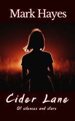
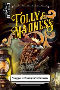
The point of all this is typesetting was making the book look as good as possible but doing so keeping page count in mind. Of course, getting it right the first time is probably the best option around. But I’ve never managed that, which is also why an offshoot of this task was that I had to redo the cover for A Scar of Avarice, as the important cover from CreateSpace to KDP was made for a set number of pages, as soon as I made that page count smaller ( by all of 5 pages) I screwed up the cover as it no longer sat in the frame right and I had to build a new one from scratch. On the plus side, that did leave me with an opportunity to make the cover of Scar fit in with the themes of all my other books ( apart from Cider lane which doesn’t count in this case) So here is the new set of covers with the new Scar cover and the cover for the forthcoming Tassels ( which is not fully complete yet but is getting there.)

The lesson here, as ever, is learn from my mistakes, keep your page count down, get professional advice if you can, play with layouts and fonts till you get it exactly as you want it, and remember Garamond 11 is king…
At some point, I will talk about typesetting kindles, which is a different kettle of fish entirely and should be done in utterly different ways
adios
mark


Very useful! Thanks, Mark.
LikeLiked by 1 person