I’m currently working my way through a print proof copy of ‘From Russia With Tassels’, carefully trying to catch those last few little typo’s syntax errors and the very occasional misbegotten sentence that needs one final little polish. This is after four drafts , my editor, my beta readers, a final polish draft draft based on my editor and beta readers feed back. And it’f the little things that are, as ever, driving me crazy. The things no one will probably notice, though they would be aware of them in some vague way if I didn’t fix them.
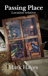
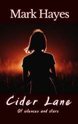
Quite apart form the text there are things like this game of spot the difference…


Now I dare say that you can spot the changes, though you might not know why they’re there. Its all to do with bleeds. When you up load a cover you have to allow for bleeds which will crop about 7mm off the top, bottom and importantly the right hand side of your cover. Which of course I forgot, hence last night I spent an hour moving the title , subtitle and the name of the idiot who forgot about allowing for bleeds, about 7mm to the left, so on the print copies the title et-al is actually centred to the cover.
A task made slightly more difficult because there are actually two layers of text behind and slightly offset form the white text is a layer of black text, and I had to make them match up to get the slight embossing shadow effect I was after, so I was literally counting the number of spaces I moved the text, so I could move the text below it the same… Which is barely perceivable in the subtitle, But I know it’s there, so it has to be right…
So, all the words shifted to the left,, the subtitle and authors name moved up a little so after the bleeds they look the same distance up form the bottom as the title is down form the top. (and yes in vanity I made my name slightly more prominent, sue me for that).
Oh and I rotated the cutthroat through a whole 10 degrees clockwise.. and moved the eye-spider a tad anti clockwise because… well, just because I thought they needed it.
These are the reasons you get a printed proof copy before unleashing this stuff to the world. the things no one one notice. Its the same inside, a few minor changes to the lay out and so far 100 pages in to the 340 I need to go through, all of about 10 minor changes to the text and two typos that went past every other filter. Because while they may be little things no one but you would ever notice, they still need to be right. Which is also why I made this cog-wheel icon for the dedication page as well last night, because while no one would notice if it wasn’t there, despite the cog wheel motif used for chapter heads and in other places in the novel like the contents page, not having one for the dedication page bugged me when I saw it in print.

All I want to do with this novel is unleash it out into the world. But till I am utterly satisfied. So the little things are driving me crazy in little ways, and no one will even know I have spent days fixing them because they will never notice, least ways no one but me… But i would know if they weren’t fixed…
Why am I saying all this? well because in a couple of week (hopefully) when this is all done ‘From Russia With Tassels’ will join its fore-barer ‘A Spider In The Eye’ out in the world. And within a few days someone somewhere will point out the one thing I didn’t fix… and I may scream…
Beware of the self published, unless you have done it yourself, you have no idea just how much work beyond just writing goes into the book you hold in your hand. So be nice when you point out the minor flaw that slipped through everything…
Because its the little things that drive us crazy…