Bad typesetting irritates me, though that is an understatement. I should make a point of saying typesetting is a subjective matter. There is no such things as the ‘right way’ to typeset a book, and just because I consider something ‘bad typesetting’ doesn’t mean it is. However, that said, there are certain rules around typesetting that are the norm. If the typeset of a book doesn’t follow these rules then for me ‘subjectively’ it is badly typeset. So when a indie book is typeset without adherence to those norms it irritates me for a couple of reasons.
The first reason is simple enough, I am of the opinion that a self publish or indie book should be indistinguishable in quality and to look at from a book published by a mainstream publishing house, because indie books that way it is judged on the merits of the writing alone. Rather than judged by poor cover design or subjectively bad typesetting. So for any indie book, having it typeset in a way that follows the norms of the publishing industry is important… in my opinion.
That is of course just my opinion.
The second reason however is not simple, or subjective. It is massively complex and to do with the way my brain works and how I read. It is not subjective but personnel, and I may be the only person in the whole world whom this effects, because frankly how could I know if that is the case one way or another. The nature of consciousness being what it is.
To try and explain though, let me start by stating that I am dyslexic.
because of my dyslexia I learned to read the hard way. That is to say, it took me a lot longer to learn to read and how I read is measurably different to the way most people do. It’s the reason I don’t do readings, as reading aloud terrifies me, mostly because I can not read ahead of what i am reading out in the way most people do. I also read slowly compared to most people, though for the most part not noticeably so, which has a lot to do with pattern recognition. The way I read involves accessing careful laid neuron pathways in my brain that were trained by the sheer belligerence of my sainted mother who made me read to her every night for the better part of a decade.
I learned to read, and do so well, several years later than most kids, and though by high-school I had an advanced reading age and read anything I could get my hands on, in those early years it was an up hill battle to get me to read at all. In short, reading did not come naturally to me and even now it still doesn’t. A lot of reading for me, more than most I suspect, is pattern recognition and because of this I need what I am reading to have a certain structure, because without structure the act of reading becomes measurably harder for me, and painful, after a fashion.
To try to give you a glimpse of what I am talking about, I am sure you all know, and detest, these things…
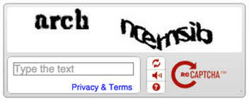
Captcha’s like that above, I cannot read at all. I get them wrong 9 out of ten times and the tenth is a guess, because it has no structure my dyslectic brain can recognise…
Now I will admit this is an extreme example. But it is the best way I can think of to explain what reading something with what I would subjectively call bad typesetting is like for me to anyone who doesn’t have my dyslectic brain. bad typesetting if for me what reading a book printed like a captcha robot checker is for everyone else…
I can do it, but it hurts to do so and it takes a while to get my brain to adjusted to read something with typesetting that is subjectively wrong, and because of this I have a somewhat visceral reaction to bad typesetting. Saying it hurts is not hyperbole, trying to read something with bad typesetting is a sure way to give myself a stress headache. Sometimes I will struggle on because the writing and the story is worth it, but as often as not, unless I it is an authors I know I will just put the book aside and read something else.
I had a bit of an unfortunate disagreement with a fellow writer this week. The unfortunate nature of the disagreement is entirely my fault because I am, as you may be aware, given to hyperbola, verbosity and on occasion have the tact of… Well… Me.
Typesetting is subjective. It is about choices, and what I might consider to be bad typesetting may no more than seem slightly odd to someone else, if they notice at all.
Most people are not me. For which the world is doubtless grateful… However, there are some basic rules for typesetting that authors self-publishing should follow, or at the very least be aware of. So as a quick guide, here are the basic rules for the industry standard in 99% of major publishing house novels.
- The main body of test should always be set to justified.
- There should be no extra spaces between paragraphs
- All paragraphs should have an indent on the first line
- Indents should be between 5 and 10 mm , no more
- Preferred font for main text should be Garamond 11 or 12 point (or 16 in ‘large type’ editions)
- fount of the book should be formatted with a title page , a legal page , two blanks and the first page
There are a whole bunch of other very subjective rules, that don’t really matter. In fairness the last couple are subjective as well, Garamond is just the most common font used in most books, and how the fount of the book is laid out is a matter of choice. The first four rules are the important ones for me.
My best advice is go to a book shelf and pick any random book, flick through it just to familiarise yourself with the typesetting style , then pick out another. You’ll find most of them are the same. Oh there will be differences, some books will have fancy graphic’s at the start of chapters. Or have every chapter start on an odd numbered page (which will be the one on the right) even if it leaves a few left-handers blank. Some will even have pages that are not numbered (though why I have no idea) But for the most part every mainstream book will have the same basic typesetting rules in place.
As i hopefully have explained, I am an extreme case when it comes to my irrational typesetting hatreds, because my brain isn’t ‘normal’ for want of another word. But even people who aren’t me will notice when typesetting seems a little off, just not quite what they expect to find in a book. So I would argue that following the basics is a must if you are looking to self publish. You want people to judge your book on your words, not on how they are presented after all.


My issue with the justified text is how often this results in words split over 2 lines and how much I hate that. I get very cranky too about books that are physically difficult to read, although apparently on entirely different terms. Some fonts should never be put into italics, for a start!
LikeLiked by 1 person
using inappropriate fonts is always an issue, garamond, at 11 point, works well with justified and avoid most hyphenated words on the end of a line, as its a very elastic font. It also has nice italics that remain easy to read , unlike some fonts where the italic seems to have been an after thought.
A lot of this is all subjective, I reserve the right to be irrational about it 🙂
LikeLike